
Maybe you recognise it. You go to your favourite social media platform and you find a message with a big claim or statement, supported by numbers. ‘2 out of 3 people believe that the color green is more beautiful than red.’ Sounds convincing, right? Numbers are often used to give additional strength to claims people make. This is because numbers look neutral. There is no arguing with numbers or statistical data.
When it comes to disinformation we see that numbers can be weaponised to support false claims. People who create these messages understand that people trust numbers, and use it for their own ideological benefits.
Take this Facebook post for example:
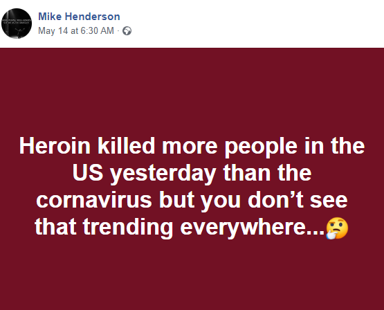
Apparently the person who posted it believes that coronavirus is some kind of a hoax, or at that the panic and lockdowns are not worth it. To support this claim he compares the number of coronavirus deaths to the number of heroin deaths per day in the US. If you were to see this post and believe it, you’d probably agree with him that the reporting on coronavirus is unbalanced. But if you dig a bit deeper, you’ll find that there is no supporting evidence to be found anywhere. The post is purposely manipulating and should therefor be qualified as disinformation. You can read this fact-check to find out more.
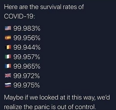
Also numbers on survival rates are being used to illustrate that the panic is ‘out of control’. Again, these numbers are made up.
It is not the case that you can only find social media posts that want to downplay the impact of the coronavirus crisis using false numbers, it is also used the other way around. The Tweet below describes a death rate in New York City, 200 times higher that the average.
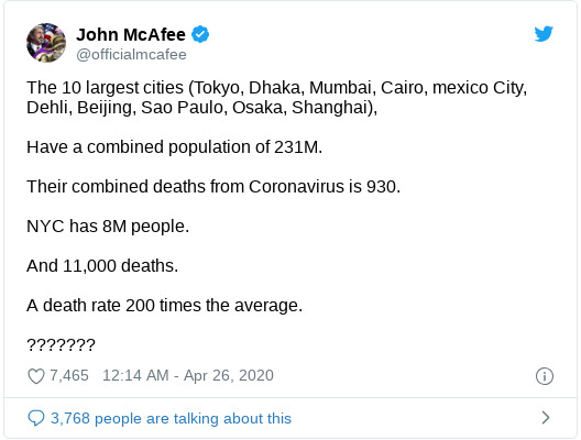
By selectively using numbers, and ignoring the fact that you have to divide the amount of infected by the amount of deaths to get a representative death rate, the tweet arrives at the wrong conclusion. In reality the death rate in New York was 8% and in the 10 largest cities between 1,1% and 7,9%. The death rate in New York is thus nowhere near 200 times the average. This tweet could therefor be considered as misinformation, as it could have been an honest mistake, but it could also be used as a disinformation strategy.
We should critically look at the numbers we encounter online. This sometimes means that you have to do the math yourself. Be sure to always check whether the claims you see are true or put up to manipulate you. Numbers may seem neutral or trustworthy, but once they become part of ideologically driven claims it is easy to be manipulated with false data, or wrong calculations. Remember the statement in the intro about people preferring green to red? It’s probably wise to check that claim.
Fact-Checking done by LeadStories